SwitchSwitch to white text on black.Switch to black text on white.
Draplin Design Co., North America
March 20, 2011
First Visit To The Oregon Zoo
Posted at 11:01 PM

032011_otter_web.jpg
The otters were great. Real crowdpleasers. Funny little guys. So wet.

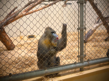
032011_mandrill.jpg
This little mandrill was eyeballing us real hard. With that look that sorta said, “If it wasn’t for the fence, barrier, electric zapper unit and two-inch bulletproof glass between us, I’d rip you fucks to shreds.”

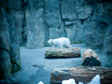
032011_polar_bear.jpg
In tribute to this polar bear, I toned the photo “extra blue,” to make it feel as cold as possible. It was 52 degrees out today and I felt bad for the thing. Her fur was looking ragged and stuff. And possibly in an act of defiance, she bear lumbered over and took a big piss for all the little kids to see.
- - - -

DID A QUICK GOOGLE ON THE MATTER: There’s really no excuse for a shitty zoo logo. I’m sure some of these turkeys could come up with some. Shameful. Missed opportunities.

- - - -

THIS WAS PLAYING IN MY HEAD THE WHOLE TIME: “Christmas At The Zoo” by the goddamned Flaming Lips. That drumbeat always gets me. Still in my head.


There Are 2 Comments

I’ve always liked the Toronto Zoo logo, and I suspect it would meet with your approval. Hometown pride represent!

Posted by: Derek on 03/21/11 at 9:04 AM

Lance Wyman’s Logo & signage system for the Minnesota Zoo (circa 1979) is one of the all-time greats.

Right up your alley Aaron…

http://sarastrand.se/blog/minnesota-zoo

Posted by: Justin Braem on 03/22/11 at 1:40 PM
Post a Comment