|
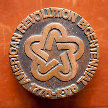
FORGED IN METAL, FOR THE AGES: Our favorite logo of all time! In belt buckle form. Wow. A little something we scored off Etsy last week, via a tip from Jon Johnson. Had to have it. Thanks, man! - - - - AMERICAN LEATHER: Peddycoart knocks one out of the park with this one: “Heirloom Leather.” One of many great posts on the expanding Things I Found (At The Thrift Store) web portal. This site always makes me want to go junkin’. There’s always this weekend. Coming up. - - - - LIKE 10,000 COOL ICONS: The Noun Project. (Thank you Breck Chumley and Jonathan Eggiman. Both of you have “the eye!”) - - - - REQUIRED VIEWING: “Handmade Portraits: Liberty Vintage Motorcycles.” This man speaks the truth. And oddly enough, as great as that little video is, and as much as it fires me up, it equally makes me really sad that the reality of what’s he’s saying is as rough as it is. I’m fighting hard to do a good job with each little thing I touch. Is that the same with some little rat kid raised on text messages and video games? Hard to say. I’m 37. Trying to make it to 38. And hell, I feel like I come from a such different time than that of the younglings who are coming up these days. Weird. I like how dirty his hands were. There you go, mouseclickers. - - - - JUST LIKE IT SAYS: Everything PanAm. Specifically, I nerd out on those old posters. Call me a “nostalgist,” call me what you will…but shit was just better back then. Graphically, at least. - - - -
- - - - ON THE PLAYER: 01. Jesus Lizard - Goat There Are 2 Comments
Man, those PanAm posters start off great and then just turn to absolute shit by the 70s/80s. Just a single photo with some lame type…gross. Nothing like the craft and illustration talent that went into the old ones. Sadly things will probably never go back to that level from the golden era. Posted by: PJ Chmiel on 03/17/11 at 6:42 PM
I love that logo! I actually used it on a tshirt of mine. Posted by: twoeightnine on 03/17/11 at 9:37 PM
Post a Comment
(you may use HTML tags for style)
Remember Me?
|


