|
September 14, 2009
Posted at 07:48 PM
Comments (5)
|
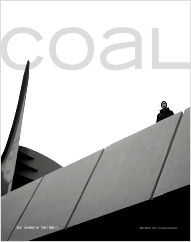
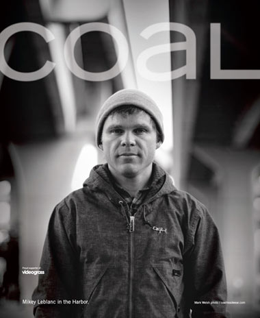
In the spirit of “putting my money where my big goddamn mouth is,” here’s some some ads from the new Coal Headwear campaign. As the mags hit the newsstands and winter revs up, I’m finally able to show you stuff we’ve been working up last spring, and all summer long. “We” being Dave, Goo and I at Wilderness. (We’re too busy to make a web site. Deal with it.) So here’s the first three placements. Black and white, man. Bravo, Brad! Real proud of how these look in the mags. - - - - TYPE YOU WON’T WANT TO MISS HERE: From an old slide carousel. Thank you, D’Emploi photo stream! There Are 5 Comments
Those are some real good lookin’ ads. Always good style that company. Always. Posted by: colin on 09/15/09 at 2:11 PM
I’ve already seen these in the mags, right? Great photography and design. Were they designed for CMYK or designed and printed as 1-color? Posted by: robert on 09/15/09 at 2:19 PM
I’ve always been a huge fan of the Coal ads, but damn, those look extra-good. Well done. Posted by: Ethan on 09/16/09 at 4:31 PM
great work.. very minimal.. speaks like coal looks. who did the photography? Posted by: Kyle Caird on 09/17/09 at 8:16 AM
YES. Love these. I love the simplicity of the brand aesthetic. So good. Posted by: haker on 09/20/09 at 8:03 PM
Post a Comment
(you may use HTML tags for style)
Remember Me?
|


