|
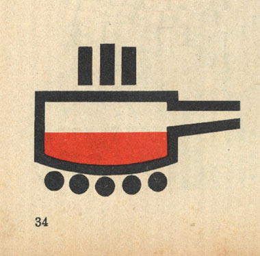
Patrick Banister comes in with a link I think I’ve seen before, but nevertheless, completely marvel over each time. Incredible, in many respects. First off, the work is so striking. And second, it’s just kind of scary all over, in a real life, ominous way. Here you go: “Cultural Revolution Clip Art, Circa 1971.” Cultural revolution/Communist/Bolshevik/Russian imagery, art, posters, stamps, tracts…whatever….have always fascinated me. And I’ve linked a good pile of them over the last couple years here and there. But always with a little hesitation. I mean, on a graphic level, they are pretty amazing. There’s design history there. But on a human level, they often turn out to represent the darkest sides of humanity. Repression. Slaughter. Freedoms taken away. Forced ideologies. Refugees. Complete families wiped out. Scary stuff. Ugly history. And completely real. So just for the record, that’s where my head was at when I linked this Flickr set up. Out of respect for a couple readers who’ve chimed in over the years, and made me think about this stuff in new ways. There Are 2 Comments
I know what you mean. You really don’t want to say that evil looks “slick.” And yet it’s compelling — it absolutely was meant to be — as good design should be, I suppose. When they’re hitting all the right eye buttons, I know I’ll respond. Knowing what the idea behind it was is another thing. Rejecting the purpose with a rational mind, it would seem reasonable you could simply admire the craft. That still won’t pull the shroud off completely. Posted by: Jim Howe on 01/06/09 at 6:40 PM
Yes the graphics are strong and we can all appreciate the formal beauty but we can’t forget the lessons of history either. I’m glad you stated that. I do get a little wary of the “dude sweet grfx”-type comments in these contexts. Posted by: Mark Notermann on 01/08/09 at 1:13 AM
Post a Comment
(you may use HTML tags for style)
Remember Me?
|


