|
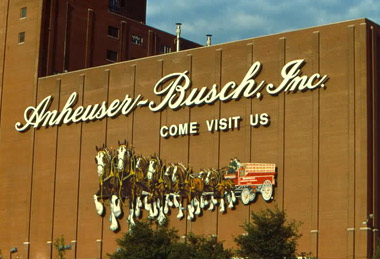
FILE UNDER, “COMPLETE BULLSHIT”: Anheuser-Busch changes over, and loses some heritage in the process. Every time I’m in St. Louis, Broadway Avenue is pretty much a “required drive.” I start to the north, and work my way through the warehouses and machine shops, go down through the city, pass that big Arch and all the way down to Anheuser-Busch zone. Home of Budweiser and other frothy products. “Panther Piss” as my dad says. And that classic logo on that building, well, its days our numbered, and our heart breaks. It’s no news that Anheuser-Busch was bought out by a European company. Everyone’s heard that one, already. But the news the last couple days is of the “updated logo” hitting the scene, bringing them into the 21st century or whatever vague business strategy jargon floats yer boat. Now sure, the company is moving on and all, and has some slick European company coming in to take the thing over, but, do they have to lose the heritage back home? History. Gone. And we’re calling “Bullshit” on that one. Or, “Clydesdale shit.” Leave the thing as it was. For St. Louis. For the people who sweated it out behind the bricks of the factory. For America. Cuz once it’s gone, well, that’s it. The locals are reacting. I wanted to show the new one, and the old one, and all that, but you know what? Fuck it. I went and found the existing one, cuz frankly, that’s how I’d want my beer factory to look. Goddammit. Here, get a load of the “new one.” Nice work, fellas. So it goes, so it goes. - - - - JUST TOO MUCH TO TAKE IN, IN ONE SHOT: Neal’s got the eye in Baltimore, and snapped this shot of the amazing Velvetone Cleaners. Man. And here’s another on from his “Type Around Town” set that we’d like to dedicate to Ryno. - - - - MORE MOTOR CITY: Detroit is beautiful. Bravo, Sweet Juniper. - - - - REALLY, REALLY NICE: A poster by Corianton Hale. Nice grit to it. As well as, everything else he does. Some cool stuff in there. (Sent in by Portland’s own Jen Davison.) There Are 8 Comments
Oh the horror! Posted by: Doug Wilson on 11/20/08 at 1:32 PM
Complete horse-shit, no pun intended. Posted by: Mark Michaylira on 11/20/08 at 1:35 PM
Absolutely retarded. Someone should be shot. Posted by: Dennis Michael on 11/20/08 at 2:14 PM
The “new” logo is an absolute travesty. Borderline clipart. Posted by: IanMac on 11/20/08 at 2:29 PM
re. Anheuser-Busch Posted by: Greg Howard on 11/20/08 at 2:50 PM
Man. If it were a product that were worth a shit, I might be really mad. Seriously, though. It’s basically the beer equivalent of Coca-Cola, or Wal-Mart, or Nike. HyperMass-marketed, low quality bullshit. Would it bother me if McDonald’s re-designed their logo? Fuck no. Who cares. Drink Grain Belt and hate with me. Posted by: Ryno on 11/20/08 at 6:11 PM
Took a little family trip through the flood ravaged Midwest last summer, hit the Brewery, took a few snaps for nostalgia, then drowned our sorrows with a Ted Drewe’s custard. InBev, that logo is criminal. What a shame. The midwest has some great signs though. Posted by: Andy on 11/20/08 at 10:18 PM
Thank you for this. as a st louis guy its awesome to hear ya come down here. it really is horrible. Posted by: Rich on 11/21/08 at 8:29 PM
Post a Comment
(you may use HTML tags for style)
Remember Me?
|


