|
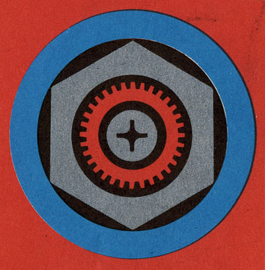
The gears are turning at the DDC. We’ve been hard at work readying all sorts of shit. Magazine pages. Vintage galleries. Memo book products. Logos. Web sites. And, new additions to the DDC portfolio. Here’s a couple mellow ones: “Annual Holi-daze Card” and “Posters.” We’ve done the work. Just trying to figure out how to show it all. Slow process. There’s a couple for ya to chew on. Go easy on us. SPEAKING OF GEARS: The image above is from a Tokyo International Trade Fair ticket picked up at The Paper Show in Portland a couple months back. Here it is in its full Japanese glory. - - - - THIS IS SO COOL: A guy’s parents give him a little metal box from his childhood, still filled with trinkets from his youth. Go through each and every one of them. So cool. (Via the kids-at-heart of Coudal Partners, Chicago, Ill.) - - - - RESPECT IS DUE: Okay all you “web savvy” people out there in the digital ether, listen up. I don’t know shit about coding, or web functionality or Java or any of that shit. I can “bold” things and “make links” and that, oddly enough, carries me through. Pathetic, really. However, I do know a good website when I see one. I am proud as hell to pass on the big new about the impressive launch of the new Holden Outerwear web site for the upcoming winter season. My colleague, arch-enemy, gamblin’ buddy and so-called “business partner” David Nakamoto is the man behind it, and well, you should give it up for him, as frankly, it’s an amazing piece of work. Bravo to David. Bravo to his coding mastermind friend David Sullivan. Bravo to Mikey and Scott from Holden for believing in those guys. - - - - FOR ME. FOR YOU. FOR US: Chartjunk gets to the bottom of the how the presidential candidate will structure their tax plans. Imagine that: More breaks for the rich on the “red” side. It’s time for change, America. The rich don’t feel it the the other 90 percent do. It’s time to make a little less and donate a little more for the common good, and not a third house, or cigarette board, or chin tuck, or whatever the hell. There Are 3 Comments
that Holden site made me flip my shit. it was utterly amazing and filled a good 45minutes of play time at work. mad props Posted by: Melissa on 09/18/08 at 10:45 AM
new work is hot. what is that font for MINUS THE BEAR on your poster? nice Posted by: brent on 09/18/08 at 12:01 PM
Great score with the Tokyo International Trade Fair ticket. It was designed by Yusaku Kamekura. He’s pretty much the Paul Rand of Japan. Posted by: dave on 09/19/08 at 9:59 AM
Post a Comment
(you may use HTML tags for style)
Remember Me?
|


