|
JUST ABOUT THERE: The house is just about done, so I’m holding off on showing “finished product” pictures just yet. I can show you this much, though: “Here’s how I picked the final color.” Photo by Arlie Carstens, Echo Park, Calif. - - - - A GREAT LISTEN: “Ed Gavagan: Drowning On Sullivan Street” (From Jess, who knows a good thing when he hears it.) - - - -
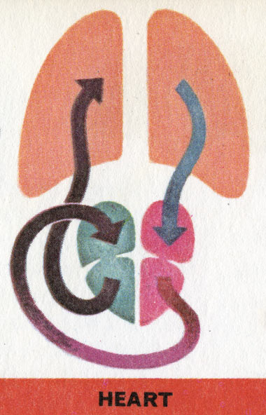
- - - - GET RIGHT WITH BARACK: Wilco backs Obama, and man, we’re right there with ‘em. I mean, musically-speaking, who the fuck’s coming out for McCain? Fuckin’ Toby Keith and Trace Atkins and shit? Go figure. Give me a break. Give the country a break. We’ve got a chance to get America back on the right track. Let’s not fuck this one up this time around. - - - - SEEN, WITH OUR OWN EYES: Saw this one over at ever-impressive Grain Edit and was floored with the simplicity, color and just overall greatness. Don’t know what it’s for, and don’t care. - - - - RECOMMENDED, FOR A LAUGH, ETC: Heckler by Jamie Kennedy. Basically, Jamie Kennedy goes after the phenomena of “Heckling” at a comedy club, and that spins off into critics, and their harsh words. He sits down with them one on one, for some of the most uncomfortable interactions I’ve seen in a long, long time. Sure, the average critic is some geek with a chip on his shoulder, hiding behind a blog surname, but to see them one-on-one with the actual person they slammed so harshly, well, it’s pretty fascinating. And weird. Then again, Jamie Kennedy ain’t really known for his contribution to the silver screen or anything, and, well, the world keeps on spinning. Recommended. - - - - RETRO DESK, NEW LIFE: “Bear” from Orange Coat web design down there in South Carolina is using old tankers in his office, and man, that is just great. Just the lift we needed. Thanks, man. Nice looking space, too. There Are 8 Comments
Get it Right with Barack: V O T E Get your friends interested, throw a house party to educate them….contact your local Barack Obama political office and they’ll let you borrow a video to play for guests. Encourage your friends to vote; you would be surprised who is NOT registered to vote. Encourage your friends to vote absentee ballot. This year the largest number of voters is expected to turn out; why not vote absentee and avoid the long lines? Concentrate on the positive things about Barack and don’t dwell on the crappy low-down politics of the opposition. Go to barackobama.com for some good information. These are my Tuesdays, when I work in a local democratic headquarters and love the conversations with dozens of people looking for a new era of politics. I am going to work at another Obama office soon; it is so very rewarding. Posted by: mamma d on 09/10/08 at 2:36 PM
We’ve got a place here in the east bay you’d dig. Got an old card catalog there. http://www.berkeleyoutlet.com/pages/metal.html Posted by: Bill Zindel on 09/10/08 at 3:28 PM
Orange coat needs to move that plastic drawer unit from Target out of the picture and eventually replace it with some steel! Posted by: Kurt Halsey on 09/10/08 at 6:32 PM
I know you don’t care, but… Anwendungstechnik moderner Anstrichstoffe: Application of modern technology paints and varnishes. Das Design ist erstaunlich! ————- Nice paint color. Posted by: Chris Murphy on 09/10/08 at 9:07 PM
Been following the blog for a while, got the new issue of the mag looks good, just thought I’d let you know. Posted by: Pat Hamaker on 09/11/08 at 9:03 AM
Thanks for the Wilco video; this is one Okie that doesn’t give a shit about Toby Keith or Trace Adkins. (Or John McSame, for that matter.) And that Field Notes Brown looks great - can’t wait to see the finished product. Posted by: Wes(tern) on 09/11/08 at 10:24 AM
That image is awesome. It is solidly my new desktop image, replacing ,a href=”http://alterdestiny.blogspot.com/2008/09/historical-image-of-day_09.html”>this one (also awesome) after only a 2-day stretch. Well done. You’ve made the day of an art-history/architecture-double-major-turned-medical-student. Huzzah! Posted by: Breck "Scrap Metal" Chumley on 09/11/08 at 12:02 PM
That image is awesome. It is solidly my new desktop image, replacing this one (also awesome) after only a 2-day stretch. Well done. You’ve made the day of an art-history/architecture-double-major-turned-medical-student. Huzzah! Sorry for the re-post. Html tag edited. Failed to preview. My bad. Feel free to just edit original rather than publishing this one. Or put up both for archival completeness, your call. Posted by: Breck "Scrap Metal" Chumley on 09/11/08 at 12:06 PM
Post a Comment
(you may use HTML tags for style)
Remember Me?
|


