|
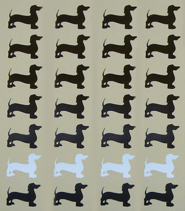
From one of favorite Lithuanians, the ever-awesome Andy Simutis, comes this shot from Lithuania, where they measure the country in Dachshunds. My kinda wayfinding! - - - - What we are listening to for the next bun ch of weeks: A new album from a little band outta Chicago that goes by the name, “Shellac.” Their new album is called Excellent Italian Greyhound, and it will be heard a bunch around here. - - - - JUST IN: From Jon Baugh, Minneapolis Citizens League: Everyone, meet little George Ellis. - - - - Lots of riff rafff is circulating around the interweb about the new London Olympics logo. Hmmm. Bryan at Coudal back up why it’s good, and, hell, it’s worth a read before you go and burn something down, you fiesty designers. I don’t know where I stand. My first reaction was of just a, “Aw, really?” Maybe feeling a little sad. Ya just kinda expect the greatest stuff from the Olympics, right? I’m puzzled. I’m leaning towards more of a, “Shoulda had Otl Aicher do it.” kinda thing. Sadly, he’s been gone for many years, but, there’s something to his restraint, and, “globalness.” That not might be a word, and, I might not know what the hell I am talking about. Hard to say. There is One Comment
Kudos to Bryan for the intelligent critique on the London Olympic logo. When we heard about the new logo and its ability to cause epileptic seizures, we had to have a look for ourselves. We, too, had a fit when we saw it, but not of the epileptic sort. The logo caused heated discussion and stir around the Tandem offices. All intelligent designerly discourse aside, the logo is just plain fucking ugly, unsophisticated and amateurish. A failed effort. The color palette is gross. Sure, it will reproduce well, but so will my ass on a Xerox. So printers, dust off your 80’s era flourescent Pantone ink cans and fire up the presses! This logo epitomizes the worst of 80’s design. The CD’s of Wolff Olins sure pulled one over and hoodwinked their IOC clients with their bullshit branding “inclusiveness and invocative emotional” speak. There’s no justification for this design debacle. I only wish our firm could be paid a fraction of what they were paid and we would have devoted a 12-month team to design circles around this schlock. There’s bold. And then there’s foolish. Thoughts?
Posted by: Eric Campbell on 06/08/07 at 7:23 PM
Post a Comment
(you may use HTML tags for style)
Remember Me?
|

