|
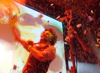
Photo: ©2006 Taylor Hill Couple more nights and I get to see the boys in action. Up and down to Seattle. Left early. Worked with Brad and Kami. Left just after the Seattle rush hour, lucky enough to beat the traffic, and then, get caught in Tacoma for a completely excrutiating “three mile two hour creep” past an overturned fule truck biohazard cleanup situation. Fuck. Didn’t get home until late, and still had work to complete. Kinda tired today. - - - - Took Gary into the vet today: Clean bill of health. Got his anal gland expressed (really, really needed it…yowza!), his nails clipped to little-to-no growling, a rabies vaccine shot and a once-over from Doc Strom. Some results: He’s in great shape. He’s at a good weight of a whole seven pounds. His teeth look good. His undercarriage feels fine. Etc. Behaviorally speaking, we’ve got some issue to work on. The whole “protective of Dad” thing is the biggest. The barking, the “on edge” demeanor and the overall tension he emits when new people are around might be able to be nipped (bad pun) by some relaxation training and a new “time out” zone somewhere in the house, with no toys, away from the action. Tough stuff for me, and for him. He means well, but, this “barking when the doorbell rings” or “can’t leave the house without going apeshit” shit is getting reallllly old. Anyhoo, we’re trying, believe us. The little man has never bit anyone, and motherfuckers, we plan on keeping it that way. Or else. - - - - “Sorry to chime in with my typical contrarian crap, and I won’t be offended if this doesn’t make it into comments. To think what all that talent could have created if it weren’t working to reinforce the Soviet regime is actually kind of sad. My family lived through a lot of the Soviet occupation of Lithuania, and a lot of my family never survived it. The very presence of the repression was real and you could feel it while you were there back then. The design that we can now look at just for it’s artistic merit was designed with a real intent to intimidate and control the people. Art that didn’t follow the official party line or even the party aesthetic was suppressed. When I see this stuff I appreciate the style (hell I even pushed it on Ally) but at the same time I feel there is some glorifying of the political intent of it. Kind of like praising the composition of a photograph of a lynching. I know it’s a bit of a downer to bring politics into art, but it’s hard not to when it’s political art.” We appreciate the perspective. First off, not only are we in awe of the design aesthetic and craft, we are constantly thinking of the evil nature behind much of the Soviet regime. The social repression manufactured and enforced for way too many years will forever be a scary example of man’s ability to be inhumane on so many levels. Not only is the overal message ominous, but, the power of the design, and it’s effect on the people is a lesson for all designers to respect. There are a million “design styles” out there, and more often than not, this type of bruteforce form and message is applied to things that just don’t fit, or, are appropriate. I mean, is any of it? Definitely something to think about. Thanks, Andy. Comments
No comments yet.
Post a Comment
(you may use HTML tags for style)
Remember Me?
|
